Sunday 13 May 2012

Movie Compositions: THE AVENGERS

Title: Thor and Captain America

Medium: Mixed Media [graphite, colour pencils, soft pastels and pen]

Render Time: approximately 8 hours

Comments: 

So after watching the movie I was immediately obsessed and just HAD to draw a scene    from The Avengers! Here is Thor and Captain America in New York City half way through the final battle (this shot takes place towards the ending).

The same process mentioned below (for the Movie Compositions post) was followed when drawing this composition, and I think both the characters turned out exceptionally well, along with the small explosion on the right. A final colour correction was done as always, to adjust the lighting a little bit.

I had a lot of fun drawing this and I'm glad it turned out so well! (maybe there are a few glitches with the perspective but I think the shading hides it).

Enjoy :)


Thor and Captain America (original drawing)

Thor and Captain America (colour correction)

Monday 7 May 2012

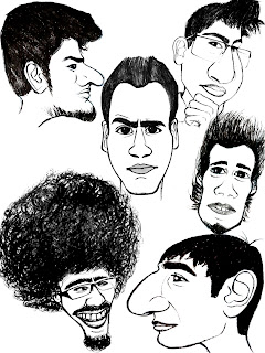
CARICATURES!

Ok, so maybe I went overboard and did a little too many caricatures...but they are so much fun to draw!
The caricatures below consist mainly of people in my family and people I'm studying with. The caricature that is common in every image is my caricature (I couldn't resist). 

For those of you that don't know what a "caricature" is, it's basically an exaggerated, "cartoony" type of drawing based on someone's profile. The difference between a portrait and a caricature is that a portrait is more realistic and proportions and details are maintained correctly throughout, whereas in a caricature the proportions are distorted and exaggerated, and some detail is reduced. 

Some of these were drawn from live reference and others were drawn from photographic reference. I think most of them turned out to be very good and accurate when compared to the actual person. 

MORE TO COME IN THE FUTURE!
(PS...can you recognize yourself?)

Let me know what you think!
Enjoy :D


Sunday 6 May 2012

Fairy Kingdom Flash Background

This was really fun to do (even though it was part of our 2nd internals in Digital Tools class). A brief description of the scene (text only) was given to us, and using that description we had to create our own background. 

Here is the description: 
     "Another beautiful sunrise bathed the forest in a warm summer's glow, chasing away the dark shadows of the night. 

     Beyond the tree line, hidden deep in the Scottish wilderness lived a secret world, lost in the history of the once great lands of the Sutherland Counties. Carefully nestled high in the trees, hidden in nature's greens and browns were the homes of the fairies of the Old Sutherland kingdom. 

     Duty, fear, and maybe even guilt had led to this secret kingdom's history being rewritten, the powerful rulers deciding what their fairy people should believe in."

I thought that curvy, twisted trees would fit this description perfectly, and the small "fairy pods" would be disguised as fruit hanging from the trees. This was done in 2 hours and a final colour correction was done to give it more of an early morning colour scheme.

Enjoy :)


Fairy Kingdom: Original


Fairy Kingdom: Colour Correction and Image Flip

Treehouse Digital Painting

This was actually done as part of our 1st internals and should have been posted a few months ago. 
It took me about 3 hours to do, done entirely in Photoshop (no customized brushes were used). 

I think everything turned out quite well (except the treehouse looks a little too much exposed...it would have been better if it was "hidden" deeper in the tree). The staircase leading up to the treehouse is not in perspective, and I only realized this after completing the painting...The rocky shore and water were done in less than 5 minutes (as we were all given only 3 hours to complete this) and those could have been a little more refined as well.

Feedback and questions are always appreciated and encouraged!
Enjoy :D


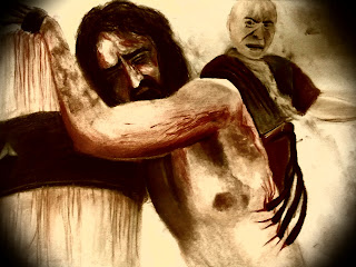
Movie Compositions: The Passion of the Christ

...So it's been a while since I updated due to the excessive amount of homework being dumped onto me, but the semester is almost done (just 3 more weeks!) and I'm sure that people will enjoy our 2D Animation Short Film that I have been working on so much since February. 

Anyways, here are 2 compositions that we had to do for our 2nd internal examinations. Here is the general process of drawing a composition from scratch:

1. First a set of 5 thumbnails was drawn (very small sample drawings just to get a sense of space and placement of objects in the composition). 

2. Then I drew some roughs (about double the size of a thumbnail, this time with more detail). 

3. Finally a working drawing was made (a full size drawing with attention to proportion, structure, anatomy, detail, etc.). 

4. Then the working drawing was traced onto a fresh piece of paper and I coloured the compositions using soft chalk pastels. The texture of the blood was extremely hard to achieve using plain pastels so I used a mix of colour pencils and pastels for those areas.

5.  A final colour correction was done in the end (increasing brightness/contrast, saturation levels and curves). 

Just incase you were wondering, these compositions are from the movie "The Passion of the Christ," directed by Mel Gibson.

Hope you like them :)
(Stay tuned for TONS of CARICATURES that shall be posted very soon!)


Composition 1 (Jesus is Scourged at the Pillar): Original Drawing

Composition 1 (Jesus is Scourged at the Pillar): Colour Correction

Composition 2 (Mother Mary and Mary Magdalene wipe the blood of Jesus): Original Drawing

Composition 2 (Mother Mary and Mary Magdalene wipe the blood of Jesus): Colour Correction